
1503
Robert Estienne is born
Into a Parisian family of printers, in the decades when movable type was still remaking what Europe could read.
The archive
Craft, carried forward.
Historical discipline remains visible in proportion, spacing and pressure—not as nostalgia, but as a working intelligence.
We carry the name of one of the great printing families of the Renaissance — and try, every day, to deserve it.
Five centuries ago the Estienne press in Paris set a standard for what a printed page could be: exact type, considered proportion, materials chosen to last. The studio you are reading about today is not descended from that house. It is named for it, and measured against it.
History · Today · Our brand
1503
Into a Parisian family of printers, in the decades when movable type was still remaking what Europe could read.

1526
Robert assumes control of the family workshop and adopts the device that still marks the name: an olive tree, with the motto Noli altum sapere — do not be haughty.
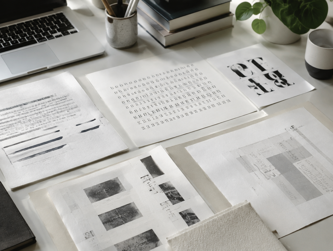
1531
His Latin dictionary becomes a foundation of modern lexicography, and proves that a printer could also be a scholar.
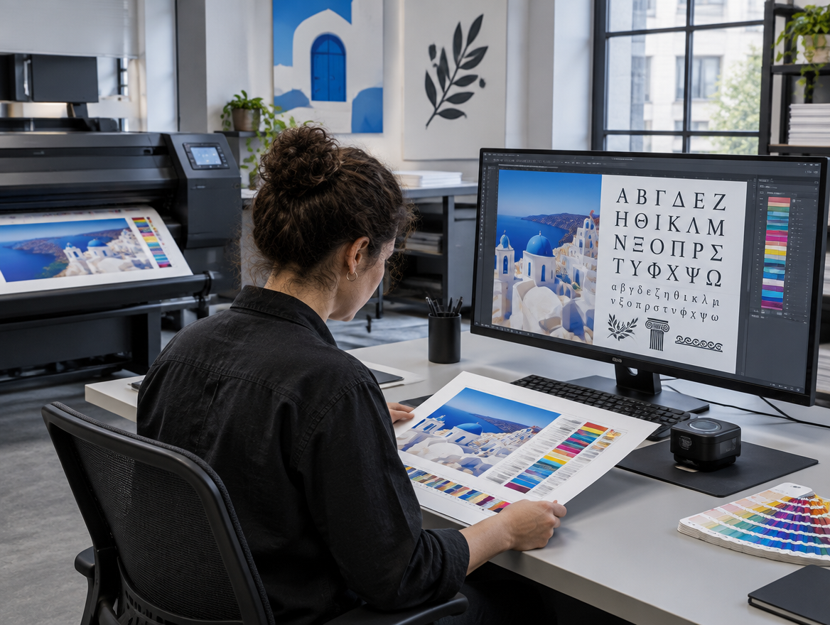
1539
Appointed royal printer for Latin and Hebrew, and later for Greek — a licence to set the standard for a kingdom.
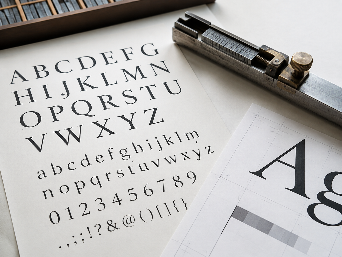
1550
His Greek New Testament is set in the grecs du roi, cut by Claude Garamond. The letterforms behind today's Garamond begin here.
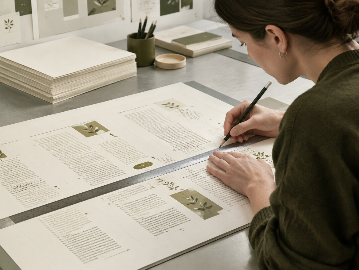
1551
His edition divides the New Testament into numbered verses for the first time. Every citation since has used his system.

1556
Having left Paris under pressure from the Sorbonne, Robert becomes a citizen of Geneva and prints on. He dies in 1559; his son Henri carries the press forward.

Design
Format, stock, colour and finish are built and inspected in three dimensions, so the decision is made against the object rather than a swatch.
Proof
Type, spacing and technique are confirmed against a proof. The hard parts of production stay on our side of the table.

Press
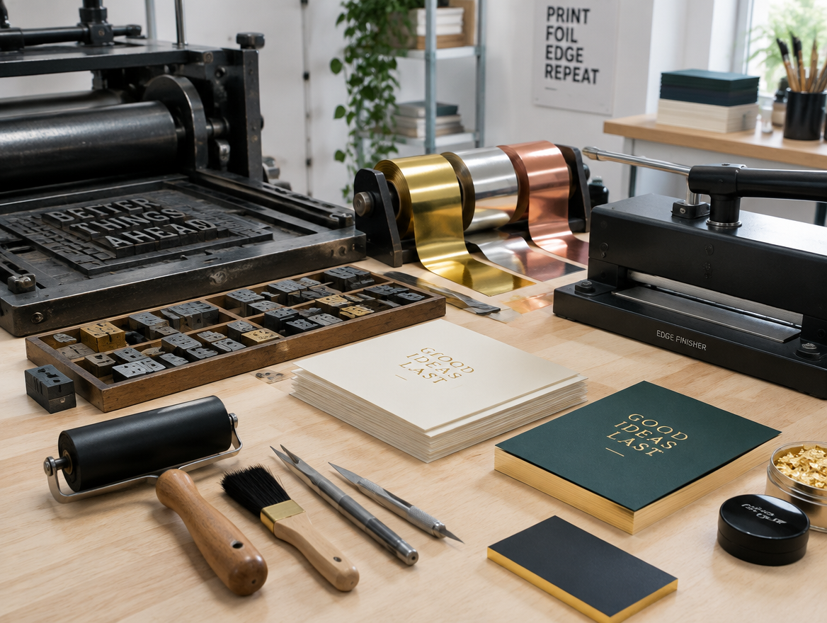
Letterpress, emboss, hot foil and edge finishing are applied in sequence by specialists, each stage checked by hand.

Deliver
Short runs, honest timelines, and an edition that arrives inspected and boxed — ready to be carried.

The mark
The olive stood for patience and cultivation — things grown rather than rushed. We keep it as a quiet motif, and as a reminder that the motto warns against pride.

The promise
Specialist material depth without the velvet rope: no gatekeeping, no minimum-order theatre. Luxury that behaves like a service, not a filter.

The refusal
We do not print the cheapest sheet that will do, we do not treat a card as a commodity run, and we do not claim a lineage we have not earned. The standard is inherited; the work is ours.
“Do not be haughty, but fear.” Romans 11:20 · the Estienne motto, adopted 1526